Last week’s Tableau Conferenceish was a much needed kick in the pants to engage more with the Tableau community online and also to start participating in some of the community challenges like Makeover Monday and Workout Wednesday on a more regular basis.
My primary goal with this viz was to keep things simple since the original viz was far too complicated. I settled on a bar chart almost immediately since that tends to be a nice way to show breakdowns of categorical data in a way that most people can interpret at a glance.
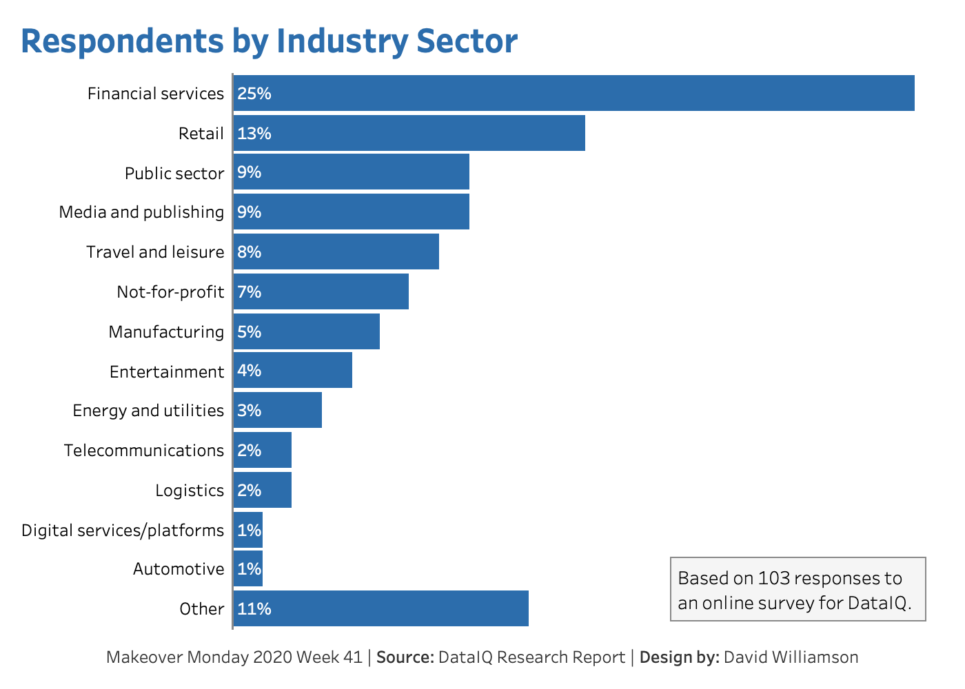
To begin with I opted to combine the three Financial Services categories (Banking, Insurance, and Other) into a single unified category. I felt that this brought the category more in line with how the other categories were presented.
From a design perspective, I matched the blue color to the blue on the section pages in the original report. I also left aligned the percentages on the bars to make it easier to scan through the values while sorting the categories in descending order by percentage. I also moved the Other category to the bottom of the list because I found it strange to have Other as the third largest category. I went back and forth on this decision, but in the end I’m happy that I decided to move it.
Finally, I decided to include some context about the sample size on the dashboard. Since the sample size was only 103 I opted to display the percentages without any decimals since the decimals were more an artifact of the sample size rather than contributing any meaningful information to the viz.
After viewing this week’s Viz Review I’m still pretty happy with how I approached this viz. I’m happy I took the simple route even if it isn’t particularly flashy. I’ll admit to not spending a huge amount of time considering an alternative title for the viz simply because I was running out of time. I’m also glad I remembered to include my name in the viz since that was a comment made again and again - I don’t think I’ll ever forget that.